

A retro t-shirt design recreates the visual language of a specific past era through its motifs, color palette, and aged-print texture, so the fastest way to start is picking one decade and one clear image to build around. Maybe it’s a cassette tape, a sunburst logo, or a punk band scrawl. This guide covers the era cues, the design rules, and exactly how to get your idea printed on a real shirt.
TL;DR:
- Choosing one specific decade ensures the design’s authenticity; combining multiple eras risks diluting the vintage effect.
- Use era-specific motifs like cassette icons for the 80s or psychedelic florals for the 70s to instantly convey the intended period.
- Match your fonts and textures to the decade, with imperfect spacing and muted colors for realism, avoiding over-distressed or overly clean designs.
- Print on ringspun cotton with DTF or screen printing to achieve a soft, authentic vintage feel, and always order a sample before bulk production.
- Avoid recreating trademarked logos pixel for pixel; focus on the iconic visual language of the era while keeping your design original.
Table of Contents
- Retro T-Shirt Design Inspiration and Motif Ideas
- Which Decade Should Your Design Reference?
- Design Rules for a Convincing Vintage Graphic Tee
- How Fabric and Printing Method Shape the Final Look
- How Do You Create and Order a Retro T-Shirt Design?
- Why We Print Retro Designs on 100% Cotton With DTF
- Order Your Retro Design Through Shay’s Print Shop
- Where the Era Details in This Guide Come From
- Sources
- FAQ
Retro T-Shirt Design Inspiration and Motif Ideas
Every good vintage graphic starts with a recognizable image, not a mood board. These motifs work because they read instantly, even from across a room.
- Band and gig posters: bold hand-set type, high contrast, often a single illustration stacked with tour dates.
- Arcade and cassette icons: joysticks, cartridges, and cassette tapes signal analog tech nostalgia at a glance.
- Surf and skate graphics: sun icons, wave lines, and hand-lettered logos borrowed from 1970s board culture.
- College athletics: varsity numerals, arched team names, and chenille-style lettering.
- Minimalist 90s slogans: one bold word or phrase, usually centered, usually distressed.
- Sun-fade stripe sets: horizontal gradient bars behind a logo, common on road-trip and event shirts.
- Psychedelic florals: swirling organic shapes in warm, saturated colors.
- Punk collage graphics: cut-and-paste type mixed with provocative, DIY-style imagery.
These motifs aren’t random. According to the Victoria and Albert Museum, retro tees function as visual membership badges. A cassette icon or a joystick does the same job a band logo did in 1978: it signals which scene you belong to. When you adapt a motif, change the specific artwork rather than copy a logo or album cover directly. Reference the style of a Sex Pistols flyer or an arcade cabinet, not the exact trademarked graphic. That keeps your design original while still hitting the right nostalgic notes.
Which Decade Should Your Design Reference?
Retro graphic tees only feel authentic when the details match the decade they’re borrowing from. Mixing eras muddies the message, so pick one and commit.
- 1970s: Psychedelic, hand-drawn shapes dominate, paired with warm, earthy palettes like rust, mustard, and olive. Type tends to be rounded and optimistic, echoing the hippie and early disco years documented in V&A’s coverage of punk-era design.
- 1980s: Neon palettes, grid patterns, and arcade or cassette icons define this look, along with sharp geometric layouts that feel almost architectural.
- 1990s: Grunge textures and single-color distressed logos take over, often blown up large across the chest rather than kept small like a polo emblem.
The biggest authenticity mistake is over-distressing a design that never would have looked worn in its own decade. For example, a crisp 1970s poster reprint generally should not look shredded; a 1990s grunge logo, on the other hand, appropriately has rough edges. Match your fonts to the era too. Rounded sans-serifs skew 70s, angular neon script skews 80s, and grunge-stamped type skews 90s.
Design Rules for a Convincing Vintage Graphic Tee
Typography, color, and texture are what separate a genuinely retro fashion t-shirt from a modern graphic with a filter slapped on top.
Typography: Pick fonts that existed or were common in your target decade, and don’t overpolish the letterforms. Slightly imperfect spacing and kerning, the kind you’d get from hand-set type or an old letterpress, sells the era better than a perfectly aligned modern font.
Color: Limit your palette to four or five tones that mimic vintage inks. Washed, slightly muted colors read as aged; bright, saturated CMYK gradients read as new.
Texture: Halftone dots and light grain overlays work well when applied naturally, echoing the photocopied flyer textures of real vintage pieces instead of piling on artificial cracks and scratches. Studying original layouts from gig posters and flyers is the fastest way to learn where that texture should sit.
File prep: Build your artwork at 300 DPI minimum, with a clear bleed and safe area so nothing critical gets trimmed. Vector files (AI, EPS, SVG) hold up best for logos and type since they scale without losing edges, while raster files (PNG, TIFF) work fine for photo-based or painterly graphics. If you’re unsure which format fits your artwork, this breakdown of file formats for t-shirt printing walks through it.
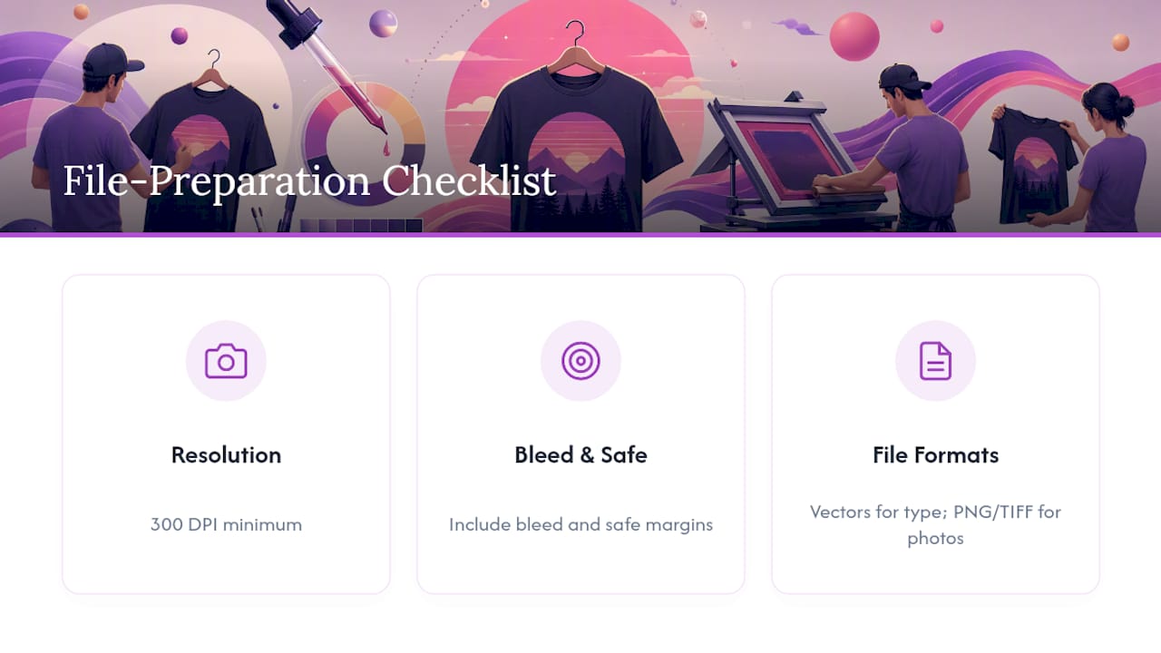
Pro Tip: Skip heavy artificial distressing filters. True vintage looks come from the limits of old printing methods, not modern damage effects, so a few clean halftone dots usually beat a “cracked leather” texture pack.
One more rule worth repeating: never recreate a trademarked album cover or band logo pixel for pixel. Borrow the era’s visual grammar, not someone else’s copyrighted artwork.
How Fabric and Printing Method Shape the Final Look
The design only tells half the story. What the shirt is printed on, and how, decides whether it actually feels vintage or just looks vintage in a photo.
- Ringspun 100% cotton vs. blends: Ringspun cotton has a finer, softer hand than standard cotton or poly blends, which is exactly the broken-in feel most retro designs are chasing. The difference between ringspun and regular cotton shows up most in how the shirt drapes and softens over time.
- DTF (direct-to-film): Soft to the touch, strong color reproduction, and a good fit for smaller or mixed-size orders.
- DTG (direct-to-garment): Best for photo-realistic or highly detailed graphics with lots of gradients.
- Screen print: Still the most durable option for large-volume runs of a single design, which is why so many original vintage tees were screen printed to begin with.
Ink choice matters too. Water-based and discharge inks sink into the fabric for a softer, more vintage feel, while plastisol sits on top of the fabric and delivers punchier, more vibrant color. Neither is wrong. It depends on whether you want a worn-in look or a bold, poster-bright graphic. Whatever method you choose, order one sample shirt before committing to a bulk run. Checking color accuracy and fabric hand on a single print saves you from an entire batch of shirts that don’t match what you had in mind.
How Do You Create and Order a Retro T-Shirt Design?
Getting from idea to finished shirt takes four steps, and skipping the sample step is the most common (and most expensive) mistake people make.
- Pick your era and motif. Choose one decade and one central image, then pull two or three real references, an old poster, a magazine ad, a concert flyer, to guide your color and type choices.
- Build the artwork at 300 DPI. Set up your file in the correct color mode, keep text and logos inside the safe area, and export as a vector file if your design leans heavily on type or line art.
- Match your fabric and print method to the look. Soft, worn-in graphics usually call for ringspun cotton and DTF; bold poster graphics can handle screen printing if you’re ordering in volume.
- Order a sample, then go bulk. Once the sample checks out for color and feel, Shay’s Print Shop’s 10-for-$99 package is an easy way to test a few different retro designs at once, or cover a small event, without committing to a huge minimum order.
Why We Print Retro Designs on 100% Cotton With DTF
We keep coming back to 100% cotton and DTF because that combination holds detail on busy vintage graphics while still feeling soft against the skin, which matters more on a shirt people actually wear than one that just looks good on a screen. Bulk pricing and fast turnaround exist because most of our customers, event planners, teams, families, need more than one shirt and need it soon.
— Jon Will
Order Your Retro Design Through Shay’s Print Shop
Shay’s Print Shop makes custom retro tees simple: 100% cotton shirts, printed with DTF for soft, vibrant graphics, and no complicated pricing tiers to sort through. Our Custom T-Shirts – 10 for $99 package is built for exactly what this guide walks you through: testing a few vintage-style graphics, outfitting a family reunion, or printing merch for a small business without a huge minimum order.
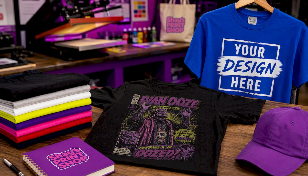
Not sure what your final design should look like yet? Browse a real example like the Vintage Power Rangers Villains T-Shirt, a 90s comic-style graphic tee, to see how a nostalgic motif translates onto a finished product. When you’re ready to build your own, visit our custom t-shirt page to upload your artwork, and remember to send a 300 DPI file with your design centered inside the safe area. We also print custom tumblers and offer vinyl stickers and custom mugs if you want to extend your retro theme beyond the shirt. Order one sample first, confirm the color and feel, then place your bulk order with confidence.
Where the Era Details in This Guide Come From
Historical motif and material details referenced throughout this guide come from the Victoria and Albert Museum and its documented punk-era T-shirt collection, alongside the Metropolitan Museum of Art’s punk apparel archive.
Sources
- Victoria and Albert Museum
- V&A collection: ‘Vive Le Rock’ T-shirt (1977-1980)
- Metropolitan Museum of Art: ‘Anarchy in the UK’ T-shirt
FAQ
How do you make a shirt look retro?
Use an era-specific color palette, slightly imperfect typography, and light texture like halftone dots or grain instead of heavy artificial distressing. Printing on ringspun cotton with a soft-hand method like DTF also helps the finished shirt feel as vintage as it looks.
What are some popular retro t-shirt styles?
Common styles include band and gig-poster graphics, arcade and cassette icons, surf and skate logos, college athletic type, and grunge-style distressed slogans. Each style pulls from a specific decade’s color palette and typography, which is why picking one era before designing matters.
What retro t-shirt designs are trending right now?
90s-style comic and cartoon graphics, like the Vintage Power Rangers Villains T-Shirt, are seeing strong interest alongside 1980s neon and arcade motifs. Nostalgic revival events such as 1980s new wave festivals are also fueling demand for that decade’s visual style.
How can I create my own vintage t-shirt design?
Start by choosing one decade and one motif, then build your artwork at 300 DPI with an era-appropriate color palette and typography. Once your file is ready, order a single sample print to check color and fabric feel before placing a bulk order, such as Shay’s Print Shop’s 10-for-$99 bulk package.
0 comments