

Send vector PDF/X or native vector files (AI or EPS) for screen printing. Send 300 DPI PNGs with transparent backgrounds for DTG and DTF. For photographic prints, a PDF/X file or a high-resolution TIFF works fine. That’s the short version, and it covers most of what you need before you upload anything.
A few rules apply, no matter which method you’re using:
- Build your file at the exact final print size and an appropriate resolution to ensure quality. Never scale up a small image later and hope it holds.
- Use CMYK for offset and screen printing jobs, but stick with sRGB for digital methods like DTG unless your printer says otherwise.
- Embed your fonts, or outline text if you’re not sure the shop has them.
Here’s a mini-checklist you can paste straight into an order form or comment box:
File type: [AI/EPS/PDF/PNG] | Size: [final print dimensions] | DPI: 300 | Color mode: [CMYK/sRGB] | Fonts: embedded/outlined | Background: transparent (if raster) | Spot colors: [Pantone codes if any]
Pro Tip: Before you export anything, ask the printer directly which PDF/X variant they want, or check their upload page for platform-specific specs. A five-second question saves a same-day reprint.
Key Takeaways
The right file format depends entirely on the printing method: vector PDF/X for screen printing, transparent 300 DPI PNG for DTG and DTF, and properly embedded fonts and CMYK color for any commercial press run.
| Point | Details |
|---|---|
| Match format to method | Send vector AI/EPS/PDF for screen printing and vinyl; send transparent PNG for DTG/DTF. |
| Build at final size | Design at true print dimensions and 300 DPI from the start, never scale a small file up later. |
| Choose the right PDF/X | Use PDF/X-1a for maximum compatibility, PDF/X-4 when your printer supports live transparency. |
| Confirm color mode first | Ask whether the job needs CMYK or sRGB before you export, since digital methods often differ from press work. |
| Upload source files when possible | Shaysprintshop’s file-check service works best with original AI or PSD files, catching resolution or format issues before printing. |
Table of Contents
- Raster vs. Vector: The Difference That Decides Everything
- File Formats and When to Use Each One
- Matching File Formats to Your Printing Method
- Getting Color Right: Modes, Profiles, and Spot Colors
- How to Export a Print-Ready PDF (and Which PDF/X to Choose)
- Resolution Rules: Getting DPI Right at Final Size
- Fonts and Text: Avoiding Missing-Font Disasters
- Transparency and Layers: Avoiding RIP Artifacts
- Your Copyable Print-Ready Checklist
- Example: How Shaysprintshop Likes Files Submitted
- What Beginners Get Wrong About File Prep
- Get Your Files Checked Before You Order
- Frequently Asked Questions
- Sources
Raster vs. Vector: The Difference That Decides Everything
Raster images are built from a fixed grid of pixels, so they blur or pixelate the moment you stretch them past their native size. Vector graphics are built from mathematical paths, so they scale to any size, from a hang tag to a banner, without losing a single crisp edge.
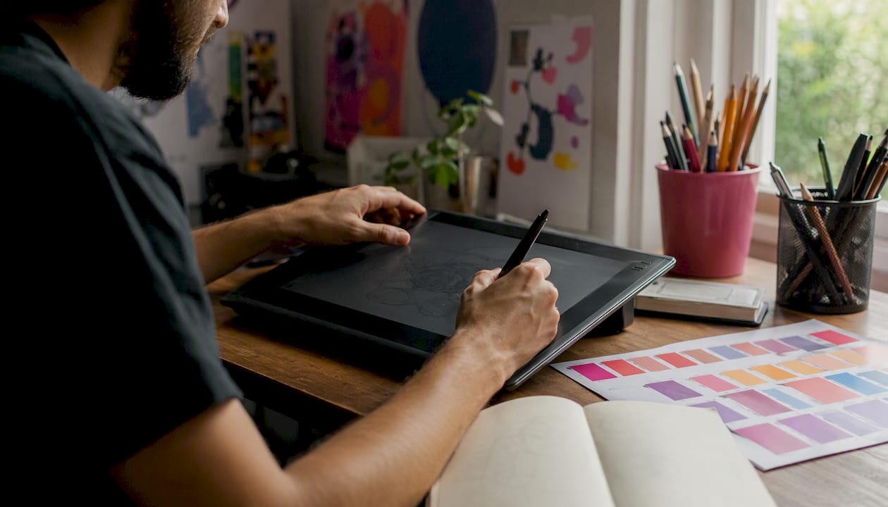
That difference matters most once ink hits fabric. Screen printers need to separate a design into individual color layers, one per screen, and vector paths make that separation clean and exact. Halftones, the dot patterns that simulate shading in printed graphics, are also far easier to control in vector artwork because the software can generate them mathematically instead of guessing from pixel data.
A photograph of your dog wearing sunglasses is a raster file, full stop; there’s no vector version of a photo. A flat, two-color logo for a company softball team, on the other hand, belongs in vector format every time, because you’ll likely need it printed small on a sleeve and huge on a banner from the same source file.
Mixing the two without understanding the tradeoff is where most print jobs go sideways. A vector logo dropped into a raster mockup at low resolution still prints blurry, because the moment you flatten it into a raster preview file, it inherits that file’s resolution limits.
Common mistakes worth avoiding:
- Rasterizing a vector logo too early, then resizing the raster version up.
- Sending a screenshot of a logo instead of the original vector or high-resolution file.
- Assuming “it looks fine on my screen” means it will print fine, when your screen displays at a fraction of print resolution.
- Combining vector text with a low-DPI raster background in one file without checking the background’s resolution.
File Formats and When to Use Each One
Every format on this list has a job it does well and a job it does poorly. Here’s what each one is actually for.
AI (Adobe Illustrator) is the native vector format and the gold standard for logos, text-based designs, and anything needing color separations. Downside: it requires Illustrator or compatible software to open natively, so most printers will also want a PDF export alongside it.
EPS is an older vector format that’s still widely accepted for screen printing because it packages paths and fonts in a way older rip software can read reliably. It lacks some of the modern transparency support newer formats offer.
PDF is the closest thing the printing world has to a universal language. It can carry vector or raster data, fonts, and color profiles in one file, which is exactly why PDF is the standard format for commercial printing. Exported correctly as PDF/X, it works for nearly every printing method.
SVG is a web-native vector format, great for websites and app icons, but rarely requested by print shops since PDF and AI cover the same ground with better print software support.
PNG supports lossless compression and true transparency, which is why PNG at 300 DPI with a transparent background is the standard submission format for DTG and DTF. It’s not built for infinite scaling like vector formats are, so it still needs to start at the right pixel dimensions.
TIFF holds detailed metadata and lossless image data, making it a solid choice for photographic prints, though TIFF doesn’t support transparent backgrounds as cleanly as PNG, which limits it on dark garments.
PSD (Photoshop’s native format) is useful for revisions since it preserves editable layers, but it’s rarely the final delivery file; most shops want it flattened and exported to PDF or PNG before printing.
JPEG should generally stay out of your submission folder. Its lossy compression creates visible artifacts at print size and it has no transparency support at all, which makes it the weakest option on this list for anything beyond a quick reference image.
| Format | Type | Transparency | Best Uses | Common Pitfall |
|---|---|---|---|---|
| AI | Vector | Yes | Logos, separations, scalable art | Requires Illustrator or a PDF export |
| EPS | Vector | Limited | Screen printing, older workflows | Weak transparency handling |
| PDF/PDF-X | Vector/Raster | Yes (X-4) | Nearly all print methods | Wrong X variant rejected by press |
| SVG | Vector | Yes | Web, app icons | Rarely requested by printers |
| PNG | Raster | Yes | DTG, DTF, digital printing | Needs correct starting pixel size |
| TIFF | Raster | Limited | Photographic, high-detail prints | Poor on dark garments |
| PSD | Raster/Layered | Yes | Revisions, working files | Not a final delivery format |
| JPEG | Raster | No | Reference/preview only | Compression artifacts, no transparency |
Matching File Formats to Your Printing Method
Different printing methods put ink (or thread) on fabric in completely different ways, and that’s exactly why one universal file type doesn’t exist.
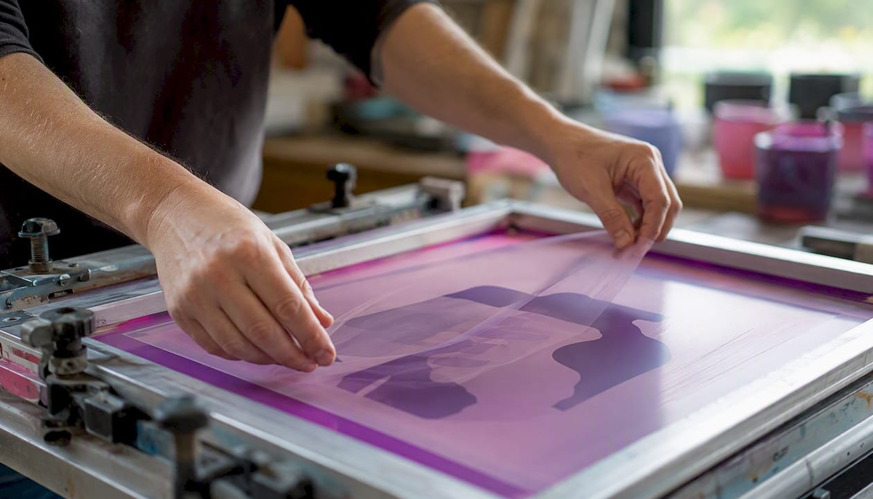
Screen printing relies on physical screens, one per ink color, so vector formats such as AI, EPS, or vector-based PDF are the professional standard because they allow color separations and Pantone spot color mapping. A raster PNG can’t be cleanly split into individual ink layers the way vector paths can. Dark garments also typically need a separate white underbase channel built into the file.
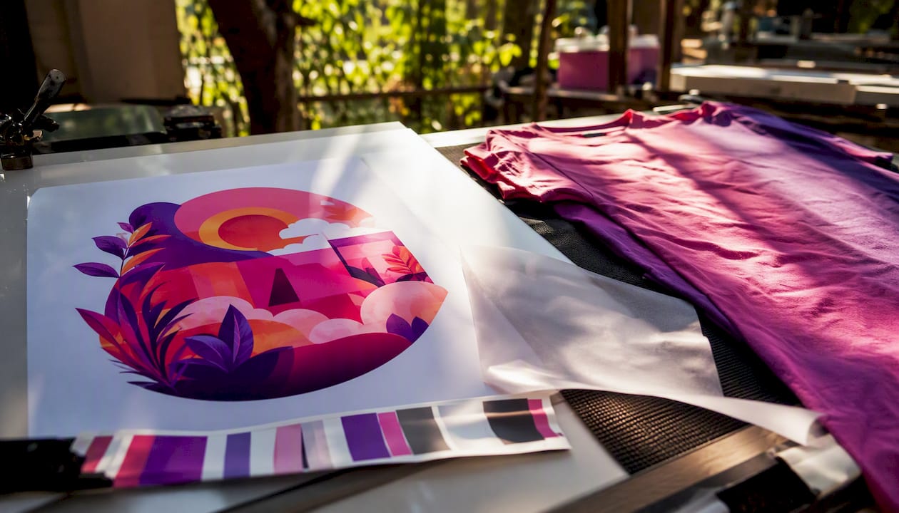
DTG and DTF print digitally, spraying or transferring ink pixel by pixel, so high-resolution PNG files with transparent backgrounds are the practical standard for these methods. A photo-realistic design that would be nearly impossible to screen print works perfectly here. You can review Shaysprintshop’s own breakdown of DTG vs DTF if you’re still deciding which method fits your order.
Heat transfer and vinyl cutting usually want vector files, since the cutter follows paths to slice the material rather than interpreting pixel color values. A single-color mascot design cut from vinyl needs clean vector edges, not a raster approximation.
Embroidery starts with vector art too, but it doesn’t stop there. A digitizer converts your vector file into a stitch file, typically DST or PES format, that tells the embroidery machine exactly where to place each stitch. Vector art gives the digitizer clean shapes to work from; a blurry raster logo makes that translation guesswork.
Getting Color Right: Modes, Profiles, and Spot Colors
CMYK is built for ink-based printing, where cyan, magenta, yellow, and black combine to reproduce color on press. RGB is built for screens, where red, green, and blue light combine instead. Send CMYK for traditional screen printing and offset work, but check first for DTG jobs, since many print-on-demand and digital workflows actually prefer sRGB PNG uploads and convert internally to their own ink profile.
ICC profiles tell your software and the printer’s equipment how to interpret color consistently across devices. Common ones you’ll see referenced include SWOP and GRACoL for US offset printing and FOGRA for European presses. You likely won’t need to attach one for a basic shirt order, but it’s worth asking about if you’re running a large multi-location job where color consistency across print runs matters.
Spot colors matter when you need an exact, repeatable shade, like a corporate logo’s specific blue. Request spot inks and hand over the Pantone Solid Coated value rather than a CMYK approximation, since CMYK mixes can shift slightly from batch to batch.
Common color mistakes to watch for:
- Sending RGB files to a screen printer expecting CMYK separations.
- Guessing at a Pantone shade from a screen instead of a physical swatch book.
- Assuming the color on your monitor matches what comes off the press.
Pro Tip: If color accuracy matters for your brand, ask about a soft proof, a digital preview built from the printer’s actual color profile, before the job goes to press. It catches mismatches before ink touches fabric, not after.
How to Export a Print-Ready PDF (and Which PDF/X to Choose)
PDF/X-4 is the better choice when your printer accepts it, since it supports live transparency without flattening. PDF/X-1a remains the safer pick for maximum compatibility, especially with older screen printing software. PDF/X-1a is widely accepted for offset work, while PDF/X-4 handles modern transparency-heavy files better.
Follow these steps when exporting from Illustrator or Photoshop:
- Set your page size to match the final trim size, then add bleed, typically 0.125 inches or 3 millimeters past the trim edge.
- Convert your color mode to CMYK for offset or screen printing jobs, or confirm sRGB if you’re printing DTG.
- Embed all fonts in the export dialog, or outline any text you’re unsure about.
- Flatten transparency only if your chosen PDF/X standard requires it; PDF/X-4 can often skip this step.
- Set the correct output intent, matching the ICC profile your printer specified, if any.
- Turn on crop marks so the printer can see exactly where the trim line falls.
A few notes on which preset to pick: choose PDF/X-1a for the widest acceptance across older RIP software, PDF/X-4 when your printer confirms support and your file has transparency effects worth preserving, and Press Quality as a general Adobe export setting when you’re not exporting to a strict X standard at all.
Before you hit send, run through this preflight list:
- Bleed and trim marks are visible and correctly placed.
- Color mode matches what the printer requested.
- All fonts show as embedded, not missing, in the export summary.
- Resolution checks out at 300 DPI at final size, not just at a smaller preview size.
Most print rejections trace back to incorrect resolution, the wrong color mode, or missing fonts, so catching these four items before export saves real turnaround time.
Resolution Rules: Getting DPI Right at Final Size
The standard for apparel graphics is 300 DPI at the size the design will actually print, not the size it happens to be on your screen. That number isn’t arbitrary. At normal arm’s-length viewing distance, 300 DPI is where the human eye stops noticing individual pixels or dots.
Here’s the math in practice: if your design needs to print 12 inches wide, you multiply 12 by 300 to get 3,600 pixels across as the minimum width your file needs. Fall short of that, and the print looks soft or blocky no matter how good the design looked on your monitor.
There are exceptions. Large banners or signage viewed from several feet away can get away with lower DPI, sometimes 100 to 150, because the viewing distance hides pixelation the eye would otherwise catch up close. A shirt graphic doesn’t get that luxury. People look at shirts from a couple of feet away, sometimes less, so 300 DPI stays the baseline for apparel specifically.
Fast fact: a design that looks sharp at “72 DPI” on a screen can still be print-ready, since screen DPI and print DPI measure different things entirely; what actually matters is the raw pixel count relative to your intended print size, not the DPI number your software displays by default.
To check your file before exporting:
- Open the image in Photoshop and check Image > Image Size for the pixel dimensions.
- Confirm the “Resolution” field reads 300 and the width/height match your actual print size, not a placeholder size.
- If pixel dimensions look thin for your target size, go back to the original source file rather than upscaling the small one.
Fonts and Text: Avoiding Missing-Font Disasters
Embedding fonts inside your PDF is the standard approach, and it’s usually as simple as checking a box in your export dialog. It packages the font data directly into the file so the printer’s system doesn’t need that font installed to display your text correctly.
Embedding can still fail, though, particularly with certain licensed commercial fonts that block embedding permissions outright. When that happens, outlining text, converting letters into vector shapes instead of live, editable text, guarantees it’ll display exactly as designed. The tradeoff is you lose the ability to edit the wording later, and outlined text files can run slightly larger.
A couple of practical notes on text itself:
- Keep line weights and stroke widths thick enough to survive the printing process; thin hairline strokes can disappear entirely on fabric.
- Avoid text smaller than about 8 points for screen printing, since fine detail tends to blur or clog on the mesh screen.
Before you export, run a font check in your software’s preflight panel. It flags any font that isn’t embedded or outlined, catching the problem before it becomes the printer’s problem.
Transparency and Layers: Avoiding RIP Artifacts
Transparency causes trouble in PDF/X-1a because that standard doesn’t support live transparency at all; everything gets flattened at export, which can occasionally introduce visible seams where transparent elements overlapped. PDF/X-4 solves this by preserving live transparency straight through to the printer’s RIP (raster image processor, the software that translates your file into dots the press or printer can lay down).
A few practical rules:
- Don’t submit a layered PSD as your final delivery file; flatten and export it to PDF or PNG first.
- Keep vector transparency live only when you’ve confirmed the printer’s workflow supports PDF/X-4.
- Use high-resolution flattening settings if your printer specifically requires flattening rather than live transparency.
Watch for faint stitching lines or a slightly visible grid pattern after flattening complex transparency effects. It’s a telltale sign the flattener split your artwork into tiles at too low a resolution, and it’s worth catching in a proof before the full run goes to press.
If flattening is unavoidable, set your transparency flattener preset to “High Resolution” rather than the default medium setting in Illustrator or Acrobat. It costs you a slightly larger file size in exchange for a print that won’t show those seam artifacts.
Your Copyable Print-Ready Checklist
Paste this into your order notes or save it as a text file you reuse for every submission:
- Final size/trim: exact finished dimensions, not the working canvas size.
- Bleed: 0.125 inches or 3 millimeters past the trim line, if applicable to your method.
- Color mode: CMYK for screen/offset, sRGB confirmed for DTG.
- DPI: 300 at final print size, verified in pixel dimensions.
- File format: vector (AI/EPS/PDF) for screen printing and vinyl, PNG for DTG/DTF.
- Fonts: embedded or outlined, confirmed in preflight.
- Background: transparent noted explicitly for raster files.
- Spot colors: Pantone Solid Coated codes listed by name, not guessed from screen.
- Special finishes: metallics, glitter, or glow-in-the-dark ink called out by name.
Name your files something a stranger could understand at a glance, like teamlogo_front_12in_pantone286.pdf, rather than final2_USE THIS.ai. Attach a one-line spec sheet in the order comments summarizing size, color mode, and any special ink requests.
If your order is large or the color needs to be exact, ask for a proof, either a digital soft proof or a physical press proof, before the full run starts. Approving a proof takes minutes; reprinting fifty shirts because a color shifted takes days.
One note on special effects: metallic foil, glitter, and glow-in-the-dark inks each print as a separate spot layer, similar to how Pantone spot colors work for screen printing. If your design calls for one of these, flag it in the file name and order notes, and keep that portion of the artwork as a clean, isolated vector shape so the separate ink layer prints exactly where intended.
Example: How Shaysprintshop Likes Files Submitted
Here’s what a concrete spec sheet looks like in practice, based on the standards this guide has walked through:
- Preferred formats: vector PDF or AI/EPS for screen-printed designs; 300 DPI transparent PNG for DTF-based orders.
- Color mode: CMYK for spot-color screen jobs; sRGB accepted for DTF/digital submissions.
- Bleed: 0.125 inches when the design runs to garment edges (rare on shirts, common on sleeve or all-over prints).
- Fonts: embedded in PDF exports, or outlined if the font can’t embed.
-
File naming: descriptive names noting size and placement, like
reunion2026_front_10in.pdf.
A sample spec snippet for a typical order: trim size 10 inches wide by 12 inches tall on the front chest, 0 bleed (standard chest placement doesn’t need it), CMYK for a two-color screen job, print location front center, with a note that the logo requires a white underbase since it’s going on a navy shirt.
Shaysprintshop specializes in 100% cotton t-shirts and DTF printing for bulk and event orders, and prefers receiving your original source file (AI or PSD) rather than a flattened export, so revisions don’t require you to rebuild the design from scratch. If you’re placing a group order, the shop’s guide to bulk t-shirt ordering walks through logistics alongside file submission basics, and the church and group event ideas page is a useful reference if you’re prepping files for a reunion or team order with multiple sizes and colors.
What Beginners Get Wrong About File Prep
The single most common mistake in file submissions is starting a design at a small, convenient canvas size and scaling it up later, rather than building at final print dimensions from the first click. It seems harmless in the moment. A logo that looked crisp at a 4 inch working size turns soft and pixelated the moment someone stretches it to fill a 12 inch chest print, and by then the customer has already approved a proof that never showed the problem.
The second most common issue is format mismatch: sending a JPEG screenshot for a job that needed vector separations, or sending a flattened PSD when a transparent PNG would have worked in half the time. Neither mistake is really about skill. It’s about not knowing which format maps to which printing method, which is exactly the gap this guide is built to close.
The fixes are almost embarrassingly simple once you know them. Start every file at its true final size, not a placeholder canvas. Use PNG with a transparent background for DTG or DTF work, and reach for vector formats the moment a job involves color separations or a cutter. For anything running as a larger production batch, request PDF/X specifically rather than a generic PDF export, since it packages fonts, color, and marks into one file the press can trust without guessing.
None of this requires expensive software or a design degree. It requires knowing, before you hit export, which four or five settings actually matter for the method your shirt is being printed with.
Get Your Files Checked Before You Order
Shaysprintshop offers something most online print shops skip entirely: a real check on your file before it goes to press, so you’re not guessing whether your PNG or PDF will hold up on fabric. Upload your logo, design, or photo, and the team looks it over for resolution, color mode, and format issues before your order goes into production, not after fifty shirts come out blurry.
That matters most for bulk orders, where a file problem caught early saves an entire batch rather than one shirt. If you’re outfitting a team, a family reunion, or a small business event, the custom shirts and apparel page is the place to start, and the 10 for $99 bulk collection covers group orders without the per-shirt markup you’d expect elsewhere. Upload your artwork, note your color and size needs, and Shaysprintshop’s team handles the rest, from file check to finished print.
Frequently Asked Questions
What’s the best file format for t-shirt printing overall? There isn’t one universal answer, since the best file type depends on your printing method. Vector PDF/X or AI/EPS covers screen printing and vinyl cutting, while transparent PNG at 300 DPI covers DTG and DTF.
Can I submit a JPEG for my t-shirt design? It’s not recommended. JPEG compression introduces visible artifacts once printed at full size, and it doesn’t support the transparent background most digital printing methods need.
Do I need to convert my file to CMYK before sending it? Only for screen printing and offset jobs. Many DTG and print-on-demand workflows actually prefer sRGB PNG files and handle the color conversion internally on their end.
What resolution should my design be for a shirt? Aim for 300 DPI at the final print size. A 12 inch wide design needs roughly 3,600 pixels across to hold that resolution without looking soft.
Should I outline my text or leave it as live type? Embed fonts in your PDF export whenever possible, since it keeps the text editable on the printer’s end. Outline text only when a font’s license blocks embedding or you’re not certain the printer has that typeface.
Sources
- How to Prepare a PDF for Commercial Print: The Complete Checklist | PDF Press
Recommended
- DTG vs DTF for Apparel: Which Method Should You Choose? – Shay’s Print Shop
- Photo on T-Shirt Printing: Best Massachusetts Providers – Shay’s Print Shop
- Bulk T-Shirt Ordering for Events, Teams & Businesses – Shay’s Print Shop
- Vistaprint Alternatives for Bulk Apparel & Event Shirts – Shay’s Print Shop
0 comments