

For adult short-sleeve tees, center your logo about 1 to a few inches wide and place it a short distance above the hem, with a typical sweet spot near the middle of that range. On long sleeves, position the design about a few inches below the shoulder seam for upper-sleeve placement, or start a full vertical run a few inches above the cuff. Your production method (embroidery versus print) will nudge the minimum size up or down.
TL;DR:
- Sleeve logos should typically be 1 to 3 inches wide, with 1.5 inches being ideal for most designs on adult short-sleeve tees.
- Proper placement varies from 2.5 to 3 inches below the shoulder for upper sleeve designs and 1 to 2 inches above the hem for subtle accents.
- Consistent measurement techniques, such as using templates and flat lay methods, are essential to maintain uniform placement across a batch.
- Full-sleeve vertical designs range from 1 to 3 inches in width and can reach up to 14 inches in length, with smaller sizes risking loss of detail.
- Always approve a digital proof before full production to avoid costly errors like off-center logos or improperly scaled designs.
Table of Contents
- What Are the Best Sleeve Print Placement Options?
- What Size Should a Sleeve Logo Be?
- How Do You Measure and Mark Sleeve Placement Correctly?
- What File Specs Do Sleeve Prints Need?
- How Does the Production Method Change Placement?
- What Are the Most Common Sleeve Placement Mistakes?
- What Sleeve Print Specs Does Shaysprintshop Actually Use?
- Why Sleeve Placement Consistency Actually Matters
- Ready to Order Your Custom Sleeve Print?
- Where These Sleeve Placement Specs Come From
- Sources
What Are the Best Sleeve Print Placement Options?
Sleeve placement isn’t one-size-fits-all. Each spot on the sleeve sends a different visual message, and picking the right one depends on what you’re printing and who’s wearing it.
- Shoulder or upper sleeve: Set 2.5"–3" below the shoulder seam. This spot reads athletic and team-oriented, which is why you see it on jerseys and event shirts constantly.
- Center or outer sleeve: The classic branded look, sitting midway down the sleeve. Apliiq’s placement guide recommends centering longer prints between the shoulder and cuff for the most balanced appearance.
- Cuff or near-hem: Small, subtle accents work here, usually 1–2" above the hem. Keep it small. Anything wider than 3" starts to look cramped this close to the edge.
- Vertical long-sleeve runs: These start near the shoulder and stop a few inches above the cuff, creating a rhythm down the arm rather than a single static logo.
Match the placement to the occasion. A family reunion shirt calls for a friendly, centered logo. A team jersey wants that shoulder placement.
What Size Should a Sleeve Logo Be?
Sizing sleeve prints comes down to a few dependable rules that scale predictably across garment types.
- Adult short-sleeve logos: 1–3 inches wide, with 1.5" hitting the sweet spot for most text and simple logos, according to Logo.
- Youth and women’s sizing: Reduce width by 20–30% from the adult standard to keep proportions readable on smaller sleeves.
- Plus and large sizes: Add 0.5"–1" to the standard width so the design doesn’t look undersized against a bigger sleeve panel.
- Vertical long-sleeve runs: Typical widths run 1"–3", with lengths reaching up to 12" for full-sleeve designs, and Screenprinting notes some vertical prints stretch as long as 14" depending on the method.
- Minimum readable size: Anything smaller than 1" risks losing fine detail in print and becomes nearly impossible to embroider cleanly.
Text and thin lines need more breathing room than solid shapes, so bump the width up if your design leans on small lettering.
How Do You Measure and Mark Sleeve Placement Correctly?
Consistency across a production run comes down to process, not guesswork. Here’s the method Shaysprintshop uses to keep every shirt in a batch looking identical.
- Lay the garment flat on a table and smooth out the sleeve so the shoulder seam and hem are both visible.
- Fold the sleeve in half lengthwise to find the centerline, or use a ruler to mark the midpoint between the front and back seams.
- Measure your offset. For short sleeves, measure up from the hem. For long sleeves, measure down from the shoulder seam, per the sleeve logo placement guidelines from Wooter.
- Use a 1" spacer or a paper template to mark the exact spot with tailor’s chalk or heat-resistant tape.
- Slide a heat-press pillow under the sleeve before pressing so the surface stays flat and the print doesn’t shift.
- Run one sample, get proof approval, then move into the full production batch.
Pro Tip: Cut a cardboard placement template once, and reuse it for every shirt in the order. It’s faster than remeasuring each sleeve, and it eliminates the small drift that happens when you eyeball placement by hand.
What File Specs Do Sleeve Prints Need?
Send your printer artwork that matches production requirements, or you’ll end up with a blurry or misaligned result. Standard resolution for DTG and DTF work is 300 DPI, with vector formats like AI or EPS preferred for small logos, and high-resolution PNG files as the backup option.
- Pixel math: A 2" × 1" logo at 300 DPI comes out to 600 × 300 pixels. Scale your file size up or down using that same ratio.
- Safe area: Keep artwork at least 1" away from the seam line and note the distance from the hem or shoulder seam directly on your file so nothing gets guessed at.
- Orientation notes: Mark whether the design reads right-side up when the arm is raised or resting, since sleeve orientation confuses more first-time customers than any other spec.
- Embroidery files: Request a digitized file separately from your print artwork, and confirm the minimum stitchable size with your embroiderer before finalizing dimensions.
How Does the Production Method Change Placement?
The printing method you pick isn’t just a cost decision. It directly shapes how small your logo can go and how it’ll look once it’s on the sleeve.
- DTG and DTF: Handle fine detail well and work across most cotton blends, though you’ll want to watch ink saturation on darker garments so the design doesn’t lose contrast. Printful’s sleeve design guide lists max sleeve areas up to 3" × 12" for full-sleeve DTG runs.
- Screen print: Platen size and registration limit how long a vertical run can go, so very tall designs may need color separations planned in advance. A comparison of screen printing and DTG breaks down where each method hits its ceiling.
- Embroidery: Has a firm minimum readable width, and the backing or padding underneath can shift placement slightly once the hoop comes off, so digitized files need small-detail simplification.
- Sample versus mockup: Approve a digital mockup for simple designs, but always request a physical sample for embroidery or full-sleeve runs, where small shifts are easy to miss on screen.
Choosing between DTG and DTF up front saves you from redesigning artwork halfway through a project.
What Are the Most Common Sleeve Placement Mistakes?
Most sleeve print problems trace back to a handful of repeat offenders, and they’re easy to catch before you press a single shirt.
- Too close to the hem or seam: Anything under 1" from either edge risks distortion once the fabric stretches or the seam pulls.
- Off-center horizontally: A small offset from the sleeve centerline looks fine in person but jumps out badly in photos, so double-check with a ruler, not your eye.
- Detail lost at small sizes: If fine lines disappear, either increase the size or simplify the design; for embroidery, remove tiny details entirely rather than fighting the stitch limit.
- Skipping the sample: New placements, unusual garment shapes, or first-time production methods all need a test run before committing to a full batch.
One misjudged placement can turn a bulk order into a costly reprint, so the fix is almost always cheaper than the mistake.
What Sleeve Print Specs Does Shaysprintshop Actually Use?
Here’s what actually happens on the floor at Shaysprintshop.
Every order gets a digital proof before production starts, so you see the exact placement and size on your shirt design before we press a single unit. For bulk runs, we lock in one placement template and apply it across the whole batch, which is how ten shirts and two hundred shirts come out looking identical. If you’re ordering the 10 for $99 shirt package for a reunion or team event, we’d recommend a single test shirt first if your logo or sleeve placement is unusual.
Why Sleeve Placement Consistency Actually Matters
We once caught a sleeve logo sitting a half inch off-center on a proof, right before a 150-shirt run for a company event. Fixing it before production saved the whole batch from looking sloppy in group photos. That one proof paid for itself many times over.
Ordering a single sample before a full run isn’t extra spending. It’s the cheapest insurance you’ll find in custom apparel, and it catches the kind of small error that’s invisible on a screen but obvious on fifty people standing together.
— Jon Will
Ready to Order Your Custom Sleeve Print?
Shaysprintshop is the direct route to a sleeve print that’s placed right the first time, without the back-and-forth of a traditional print shop that makes you guess at specs over email. Our 10 for $99 custom t-shirt package includes 100% cotton shirts personalized with your logo, photo, or design, built for events, businesses, and family reunions.
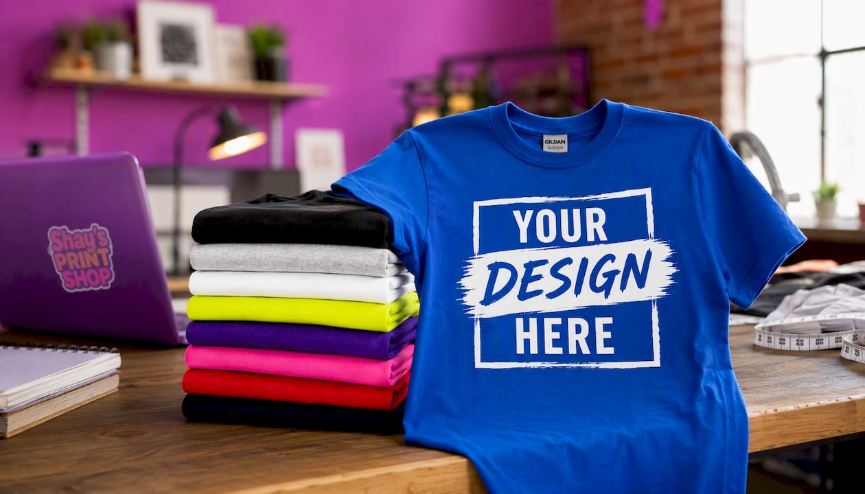
Every order goes through a digital proof so you can confirm sleeve placement, size, and color before anything gets pressed. Upload your artwork, tell us where you want it, and we’ll send a proof for approval before your batch runs. If you need a bespoke placement or want to see a physical sample first, reach out before ordering. Ready to start? Upload your design and place your order today.
Where These Sleeve Placement Specs Come From
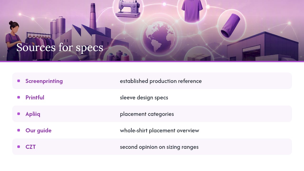
The measurements and size ranges in this guide draw from established apparel production references, including Screenprinting, Printful’s sleeve design specs, and Apliiq’s placement categories. For a broader look at placement across the whole shirt, not just the sleeve, check our own logo placement guide or see how sleeve choices pair with front and back designs. Designers wanting a second opinion on sizing ranges can also reference CZT’s logo placement guide.
0 comments