

Place your logo on the left chest, 3" below the shoulder seam, sized 3.5" wide for best visibility on adult shirts. That spec is the default industry standard for most event tees and uniforms.
Here are the most common placements at a glance:
- Left chest: 3" below shoulder seam, 3.5" wide (go up to 4" for wider horizontal logos)
- Center chest: top edge 3–5" below collar, 6–10" wide for adults
- Full front: top edge 2–3" below collar, 10–12" wide
- Back collar: 1–2" below back collar seam, 1–2" wide
- Sleeve: centered on outer sleeve, 1–4" wide (2" most common)
Copy-ready spec for your printer:
Placement: Left chest
Size: moderately sized square
Anchor: slightly below shoulder seam, centered over left chest
File: Vector (AI/EPS/PDF) or 300 DPI PNG at final print size
Pro Tip: Before approving a bulk run, ask your vendor for a digital mockup with measurement annotations. Confirm the print area matches your spec — garment construction varies by brand and size.
Table of Contents
- What do anchor points and placement terms actually mean?
- Where exactly should you place a logo on the front?
- How do back placements work?
- What sizes work for sleeve and small-area placements?
- How does embroidery differ from DTG, DTF, and screen printing?
- How do you adjust placement for polos, hoodies, jackets, and kids’ shirts?
- How do you measure and mark placement on a physical shirt?
- What are Shaysprintshop’s default placement specs?
- Key Takeaways
- The placement detail most people get wrong
- Ready to print? Here is how Shaysprintshop can help
- Useful sources for placement charts and file specs
What do anchor points and placement terms actually mean?
Anchor point, shoulder seam, collar center — printers use these terms constantly, and a misunderstanding between you and your vendor is the most common cause of a misplaced logo. Getting the vocabulary right before you submit your file saves a reprint.
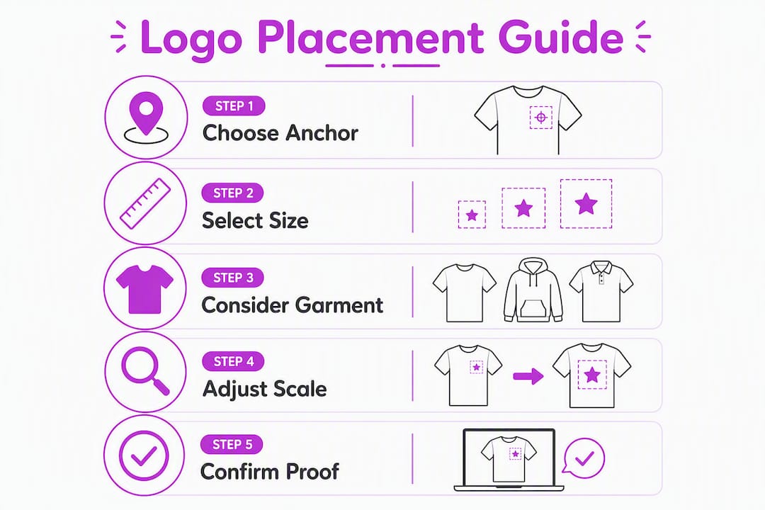
An anchor point is the reference location your printer uses to position the design on the garment. It is not always the center of your logo. For a left-chest placement, the anchor is typically the top-left corner or the visual center of the design, measured from the shoulder seam. For center placements, it is the horizontal midpoint of the shirt and a set distance below the collar.
Printers measure from three main references:
- Shoulder seam: the stitched line running across the top of the shirt from neck to sleeve. Left-chest and sleeve placements almost always reference this seam.
- Collar center: the midpoint of the neckline. Center-chest and back-collar placements reference this point horizontally.
- Collar-to-hem distance: used for full-front and full-back placements to set the top edge of a large design.
On the file side, vector formats (AI, EPS, PDF) are preferred for any logo going to print because they scale without quality loss. Raster files (PNG, TIFF) must be at least 300 DPI at the exact final print size. Embroidery requires a digitized file in DST or PES format — a standard PNG or vector file cannot go directly to an embroidery machine without a digitizing step.
Logo placement choices also communicate brand personality. Left chest reads as classic and corporate. Back-collar and sleeve placements feel contemporary and lifestyle-oriented. Knowing that helps you choose a location that matches your brand’s tone, not just its size.
Where exactly should you place a logo on the front?
Front placement is the first thing people see, so getting the position and size right matters. The three main front options each serve a different purpose.
Left chest
The left-chest standard puts the top of your design slightly below the shoulder seam, centered over the left chest. For most adult shirts, a moderate square design fits cleanly, and wider horizontal logos can be used without the design looking oversized.
| Placement | General width | General height | Youth width | Youth height | Anchor |
|---|---|---|---|---|---|
| Left chest | 3.5" | 3.5" | 3" | 3" | 3" below shoulder seam |
| Center chest | 6–10" | 6–8" | 6" | 3" | 4–5" below collar |
| Full front | 10–12" | 10–14" | — | — | 2–3" below collar |
Youth shirts scale down noticeably. A left-chest logo that reads well at 4" on an adult medium will crowd the neckline on a youth small at the same size. Drop to 3" wide and verify the anchor point sits no closer than 2.5" from the collar.
Center chest
Center chest works best for bold graphics, text-heavy designs, or anything that needs visual impact. The top edge of the design starts 3–5" below the collar, with smaller graphics sitting closer to 2–3" below the neckline and larger ones starting 5–6" down for balanced composition. Adult widths run 6–10" depending on design complexity.
Choose center chest over left chest when your logo is wide, symmetrical, or meant to be read from a distance — event shirts, team uniforms, and band merch all benefit from the center position.
Full front and oversize
Full-front designs start 2–3" below the collar and typically run 10–12" wide on adult shirts. This is the maximum usable print area for most standard tees. Always confirm the exact printable area with your vendor before finalizing art — some garments have seam-to-seam limits that are narrower than 12".
How do back placements work?
Back placements split into two distinct zones: the subtle upper-back hit near the collar and the large full-back graphic that dominates the shirt.
- Back collar / upper yoke: Set the design 1–2" below the back collar seam, sized approximately 2" wide. This is a branding whisper — a URL, a tagline, or a small secondary logo that reads up close but stays invisible at a distance.
- Upper back (shoulder-blade area): Start the design 3–4" down from the collar for wider text or logos. Recommended widths run 10–14" depending on the garment’s back panel width.
- Full back: Top edge 3–4" below the collar, with adult designs typically 10–14" wide and 10–15" tall. Full-back graphics are high-visibility from behind but invisible face-to-face, so they work best as a statement piece rather than a primary brand mark.
A proven layout for event and retail shirts pairs a small left-chest logo with a larger back graphic. The front hit identifies the brand quickly; the back carries the story, the event name, or the roster. This approach gives you both immediate recognition and a design people want to look at.
What sizes work for sleeve and small-area placements?
Sleeves are narrow, and that constraint shapes every decision you make about what goes there.
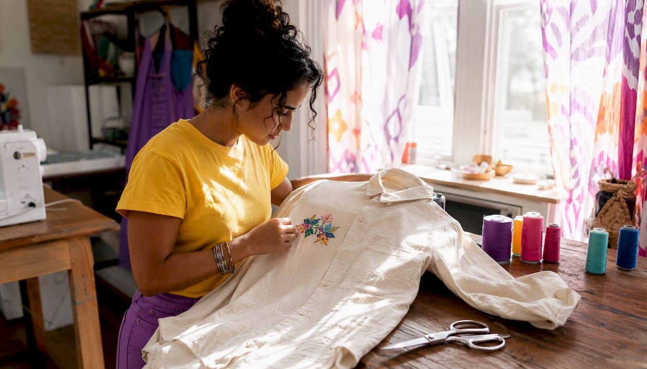
The standard sleeve placement sits centered on the outer sleeve, approximately 1" above the hem on short sleeves. Keep designs between 1–4" wide, with 2" being the most practical size for most short-sleeve shirts. Long sleeves give you more vertical real estate, but the width constraint stays the same.
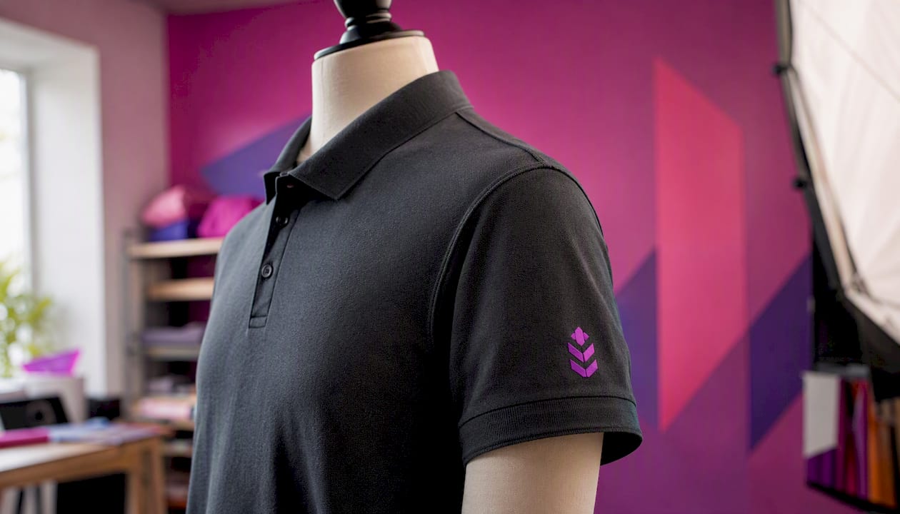
Pocket-area placements and hem tags follow similar logic: 1–3" wide, anchored to avoid seam interference. If your design sits too close to a side seam or a pocket edge, the fabric tension during printing or embroidery can distort the image.
Polos deserve a specific note. The left-chest position on a polo typically sits slightly higher than on a standard tee because the collar sits higher on the chest. The button placket also shifts the visual center of the shirt, so always request a mockup on the actual garment photo rather than a flat template. What looks centered on a crew-neck template will read off-center on a polo.
For any narrow surface, simplify your mark. Drop thin strokes, small type, and fine gradients. A clean icon or monogram reads far better at 2" than a detailed logo with a tagline underneath.
How does embroidery differ from DTG, DTF, and screen printing?
The decoration method changes what you can place, where you can place it, and what your artwork needs to look like before production starts.
Embroidery builds images from thread, and thread has physical limits. Fine lines thinner than about 1/16" often stitch out as a blurry mass rather than a crisp edge. Very small text — anything under roughly 1/4" tall — is nearly always illegible after stitching. The practical minimum for a legible embroidered logo is about 1" tall. Maximum chest embroidery areas typically run 4" x 4" for left-chest placements; sleeve embroidery caps out around 2" x 2" on most machines. Stitch density affects both cost and fabric feel — a dense fill on a lightweight shirt can cause puckering.
DTG (direct-to-garment) and DTF (direct-to-film) handle gradients, photographic detail, and fine lines well. DTF in particular transfers a pre-printed film to the garment, which means it works on cotton, blends, and dark fabrics without the pretreatment step DTG requires. Both methods work at the full range of placements — left chest through full front.
Screen printing excels at bold, flat colors on large runs. It struggles with gradients and very fine detail, and each color adds a screen (and cost). Multi-color full-front designs can raise both price and lead time significantly.
| Method | Min. practical size | Max. chest area | File needed | Detail level |
|---|---|---|---|---|
| Embroidery | ~1" tall | ~4" x 4" | DST/PES (digitized) | Low (simplified marks) |
| DTG/DTF | No hard minimum | Up to ~12" x 16" | Vector or 300 DPI raster | High (gradients, photos) |
| Screen print | 1/4" for text | Up to ~12" x 16" | Vector preferred | Medium (flat colors best) |
Simpler marks with thicker lines and solid fills produce better embroidery results. Thin strokes and small type increase digitizing costs and often stitch out illegibly. For a screen print vs. DTG comparison that goes deeper on method trade-offs, that resource covers the practical differences well.
How do you adjust placement for polos, hoodies, jackets, and kids’ shirts?
Each garment type introduces a construction detail that shifts where your logo should land.
- Polos: Move the left-chest logo slightly higher — about 2–2.5" below the collar rather than 3" — to clear the placket. Avoid printing directly across the button line. Keep the design to 3–4" wide.
- Hoodies and sweatshirts: Thicker fabric and internal seams can create uneven surfaces. Measure placement on a flattened, unfolded garment. For full-front designs, account for the hood-string grommets and the kangaroo pocket seam — both can interrupt a large print.
- Jackets: Chest pockets, zipper lines, and heavier construction all compete for space. Place logos higher on the chest and larger than you would on a tee — a 4–5" wide logo reads better on outerwear than a 3" mark that gets lost in the fabric.
- Youth shirts: Scale proportionally. A left-chest logo sized for adult medium should be smaller on youth sizes. Verify the anchor point stays suitably distant from the neckline on the smallest size in your run.
- Toddler shirts: Keep designs to 2–3" wide maximum, centered on the chest. Toddler print placement needs extra attention because the entire front panel is small — a design that looks fine on a mockup can crowd the neckline on the actual garment.
Test your placement on the smallest and largest sizes in your run before approving production. A spec that works on a medium can drift too close to the collar on an XS or look undersized on a 3XL.
How do you measure and mark placement on a physical shirt?
A repeatable workflow prevents the most common placement errors. Here is the process, step by step.
- Lay the shirt flat on a clean, hard surface. Smooth out all wrinkles. Fold the shirt in half vertically to find the true center and mark it lightly with a fabric chalk marker.
- Measure from the shoulder seam down to your anchor point. For left chest, that is 3–3.5". Mark the spot.
- Confirm horizontal position. For left chest, the design center should sit roughly over the left chest muscle — about 4–5" from the center fold toward the left sleeve.
- For center placements, measure from the collar center straight down to the top edge of your design area.
- Create a digital mockup at actual print size. Use a ruler overlay or measurement annotations in your design file. Export at 300 DPI in the correct color profile (RGB for DTG/DTF, CMYK or Pantone for screen printing).
- Preflight your file: confirm file type (vector AI/EPS/PDF, or 300 DPI PNG/TIFF), color codes (Pantone/PMS numbers for screen printing, thread color codes for embroidery), and final print dimensions.
- Send the spec to your vendor with placement, size, anchor reference, file type, and color instructions written out explicitly. Clear specs reduce back-and-forth and shorten turnaround.
Pro Tip: Order a single-shirt proof before committing to a full run, especially for embroidery or oversized prints. A physical sample catches placement drift, color shifts, and stitch issues that a digital mockup cannot show.
What are Shaysprintshop’s default placement specs?
These are the working defaults Shaysprintshop uses for standard custom cotton shirt orders. Copy them directly into your order form or email.
Default specs:
- Left chest (adult): 3.5" wide x 3.5" tall, anchor 3" below shoulder seam, centered over left chest
- Center chest (adult): 8" wide, top edge 3.5" below collar, horizontally centered
- Back collar: 2" wide, set 1" below back collar seam, horizontally centered
- Youth left chest: 3" wide x 3" tall, anchor 2.5–3" below shoulder seam
File preferences: Vector (AI, EPS, PDF) preferred for all placements. Raster files accepted at 300 DPI at final print size (PNG or TIFF). Embroidery orders require DST or PES files; if you only have a vector, Shaysprintshop can discuss digitizing options.
Copy-paste spec snippet for your order:
Placement: Left chest
Final size: 3.5" W x 3.5" H
Anchor: 3" below shoulder seam, centered over left chest
File: Vector PDF
Colors: [Pantone/PMS codes or RGB hex values]
Sizes/quantities: [list here]
Target delivery: [date]
Pro Tip: When your design involves a pocket panel, a seam, or a layered garment like a jacket, send a photo of the actual garment alongside your spec. A photo removes ambiguity that even a detailed written spec can leave.
Key Takeaways
Correct logo placement on shirts comes down to three things: the right anchor point, the right size for the garment, and a production-ready file that matches your decoration method.
| Point | Details |
|---|---|
| Left chest is the default | Place 3" below the shoulder seam, 3.5" wide for adults; scale to 3" for youth sizes. |
| Size varies by placement | Center chest runs 6–10" wide; full front runs 10–12"; back collar stays at 2" wide. |
| File format matters | Use vector (AI/EPS/PDF) for print; 300 DPI raster at final size; DST/PES for embroidery. |
| Always proof before bulk | Request a digital mockup with measurements, and order a physical sample for embroidery or oversized prints. |
| Shaysprintshop defaults | Left chest at 3.5" x 3.5" anchored 3" below the shoulder seam; center chest at 8" wide, 3.5" below collar. |
The placement detail most people get wrong
Here is what actually trips up orders: people treat placement as a design decision when it is really a production decision. The logo looks great in the mockup, but nobody checked whether the anchor point was measured from the collar or the shoulder seam. Those two references can put the same logo an inch apart on the finished shirt.
The other underestimated issue is scaling across a size run. A spec written for a medium will drift noticeably on an XS or a 2XL. The logo that sits perfectly on the chest at medium can creep toward the neckline on a small or look like a pocket square on a 3XL. Testing on the smallest and largest sizes in your run is not optional — it is the step that separates a clean order from a reprint.
Placement also signals brand identity in ways most people do not consciously register. A left-chest logo reads as established and professional. A back-collar hit reads as streetwear or lifestyle. An oversized center graphic reads as bold and expressive. None of those is wrong — but choosing one without intention means your shirt communicates something you did not plan.
The last common pitfall: sending embroidery-bound artwork that was designed for print. Thin strokes, gradients, and small type do not survive the digitizing process. Simplify the mark before it goes to the embroiderer, not after you see the stitched sample.
Ready to print? Here is how Shaysprintshop can help
You now have the specs. Shaysprintshop handles the production, with custom 100% cotton shirts starting at 10 for $99 and DTF printing that handles everything from left-chest logos to full-front graphics with sharp detail on any color fabric.
Send your order with these details and Shaysprintshop will take it from there:
- Final-size artwork (vector preferred, or 300 DPI PNG/TIFF)
- Placement spec (location, size in inches, anchor reference)
- Color instructions (Pantone/PMS, RGB hex, or thread color codes)
- Sizes, quantities, and any garment color preferences
- Target delivery date
Not sure about your placement or file? Request a quote and the team will review your artwork and confirm specs before production starts. Every order includes a digital proof so you can verify placement before a single shirt is printed. For bulk event orders, family reunions, or team shirts, the 10 for $99 bundle is the fastest path from your design to finished shirts.
Useful sources for placement charts and file specs
These resources give you authoritative placement charts, file-spec pages, and method comparisons to verify vendor-specific limits and download templates.
- Placement T-Shirt Design Size Chart: 15 Print Rules — Kittl — 15 practical rules covering left chest, back collar, sleeve, and pocket-area placements with size ranges.
- Logo Placement on Shirt: Sizes and Positions — Shopify — explains how placement communicates brand identity and covers all major shirt positions.
- T-Shirt Logo Design Placement Guide with Size Chart — Fourthwall — placement guide covering DTG, DTF, and sublimation with size recommendations per location.
Always check your specific vendor’s product page for exact print-area limits and downloadable templates before finalizing your artwork. When specs conflict between sources, your vendor’s proofing process is the definitive answer.
0 comments