

The fastest way to get colors on paper or fabric to match what you see on screen is to calibrate your monitor and workspace, apply the correct ICC profile with the right rendering intent, soft proof before you send the file, turn off automatic color correction in your printer driver, then print a physical proof on your final material and measure it. A perfect match is not realistic, so aim for visual agreement and a Delta E score within commonly accepted tolerances. A print shop using this sequence for custom orders can better manage color accuracy.
TL;DR:
- Calibrating your monitor with a colorimeter and viewing it under neutral, consistent lighting is essential for accurate color assessment.
- Always order a physical proof on the exact final substrate to verify color match, since different materials drastically affect appearance.
- Embed ICC profiles in your files and avoid double profiling; turn off printer color adjustments to ensure consistent color management.
- Use a spectrophotometer or measurement device to check proof delta E scores, aiming for 1.5 to 3.0 depending on color precision needs.
- Small businesses should focus on a calibrated screen, one physical proof on final material, and stable driver settings rather than chasing perfect on-screen color.
Table of Contents
- Quick checklist: exact steps to follow before you print
- Calibrate your monitor and viewing environment
- Create and manage color-managed files
- Soft proofing and checking proofs before you print
- Printer setup and driver settings: avoid double profiling
- Substrate and materials: how paper and fabric change color
- Measure and verify: instruments and Delta E tolerances
- Ordering proofs, iterative adjustments, and final approval
- How Shay’s Print Shop applies this workflow in production
- The gap between color theory and what small businesses actually need
- Order a calibrated sample or small run from Shay’s Print Shop
- Sources
- FAQ
Quick checklist: exact steps to follow before you print
Follow these steps in order every time you send a new design to print. Skipping one step is usually why colors come out wrong.
- Set your room lighting to a neutral 5000 K bulb and calibrate your monitor with a hardware colorimeter.
- Download and install the ICC profile for your specific printer and paper or fabric combination.
- Choose your rendering intent: perceptual for photos, relative colorimetric when you need to hold a brand color.
- Soft proof the file in a color-managed app, turning on Simulate Paper Color and Simulate Black Ink.
- Adjust any colors that look flat or shifted before you export.
- Open your printer driver and set color adjustment to Off or No Color Adjustment.
- Print one physical proof on the exact substrate you plan to use for the full order.
- Measure the proof with a spectrophotometer if you have one, or compare it under the same 5000 K light you calibrated with.
- Approve the proof or note specific fixes and reprint before running the full job.
Each step exists because color drifts at a different stage: your screen, your file’s color data, your printer’s software, and your paper all have a say in the final result.
Calibrate your monitor and viewing environment
Your monitor is the first place color goes wrong, and most people never touch its settings after unboxing it. Ambient light changes how your eyes perceive color, and a warm household bulb will make a neutral gray look yellow or pink on your screen without you noticing.
- Set your room’s viewing light to a neutral temperature commonly used across the printing industry for judging color, according to Quick Color Match guidance.
- Use a colorimeter for monitor calibration since it reads the light your screen emits directly.
- A spectrophotometer does more: it can also read printed samples, which makes it the better buy if you plan to check proofs too.
- Target a monitor white point of D65 and a brightness around 100 to 120 candelas per square meter for print work.
Save your calibrated profile as a named preset like “Print Check” so you can switch back to it any time you review a proof, and keep your everyday brighter setting separate for general browsing.
Pro Tip: Recalibrate your monitor once a month; LCD backlights drift enough over a few weeks to throw off a color check without you realizing it.
Create and manage color-managed files
Where you design and how you export the file decides whether your printer receives accurate color data or a guess. Most design software defaults to RGB, which covers more colors than any printer can reproduce, so the choice of when to convert matters.
- Design in RGB for as long as possible since it holds more color information for editing, then convert to CMYK only when you are ready to finalize the file.
- Assign a profile when a file has no embedded profile and you know what space it should represent; convert when you need to change the actual color values to match a new profile.
- Embed the working profile in every exported file, since a missing or mismatched profile is one of the most common reasons a “correct” file prints wrong.
- Pick perceptual rendering intent for photographs and gradients, and relative colorimetric when a specific brand color needs to stay as close as possible to its original value.
ICC profiles and rendering intents are the standard language that lets a screen, a printer, and a piece of paper all agree on what a given color should look like. Without an embedded profile, your printer is left guessing at your intent, and guessing produces the shifted, muddy colors most people blame on “bad printers” when the real issue is a missing file setting.
Soft proofing and checking proofs before you print
Soft proofing shows you, on screen, what your design will look like once it hits paper or fabric, before you spend money on a physical print. Open your printer and paper’s ICC profile inside your proof setup, select your rendering intent, and turn on both Simulate Paper Color and Simulate Black Ink to see a close approximation of the finished piece.
- Load the correct printer and substrate profile in your proof setup dialog rather than a generic default.
- Turn on Black Point Compensation, which keeps shadow detail from crushing to solid black during the conversion, based on Adobe’s color-managed workflow guide.
- Watch for warning overlays on out-of-gamut colors, which flag shades your printer physically cannot reproduce.
- Nudge saturated colors down slightly rather than leaving them to be substituted automatically.
A file that looks perfect in a basic photo viewer can look different in a fully color-managed app, and that is not a bug. The color-managed app is reading your embedded profile correctly; the basic viewer often ignores it entirely, which is why two people looking at “the same” file can see two different results.
Printer setup and driver settings: avoid double profiling
Color management only works when one part of your system handles the conversion, not two. If your design app applies your ICC profile and your printer driver also tries to “improve” the color, you get double profiling, and the result is usually worse than doing nothing at all.
- Set your printer driver’s color adjustment to Off, No Color Adjustment, or Color Controls Off whenever you are printing from a profile-managed file, a step multiple printer makers list as essential in Canon and Epson driver guidance.
- Select the correct media type in the driver, since paper weight and coating change how much ink the printer lays down even before profiles come into play.
- Save this combination as a driver preset so you are not resetting it every time you print, according to Mohawk’s overview of RGB and CMYK printing.
- Use an IT8.7/4 target chart if you ever build a custom profile for a specific paper stock, since it gives you known reference values to measure against.
Pro Tip: If your prints suddenly look flat or oversaturated after months of good results, check your driver settings first. An automatic driver update sometimes resets color adjustment back to “on.”
Substrate and materials: how paper and fabric change color
The same file will look different on glossy photo paper, matte cardstock, and cotton fabric, and that difference has nothing to do with your file being wrong. Glossy and coated papers reflect light and hold ink pigment on the surface, producing richer, more saturated color. Uncoated paper and cotton fabric absorb ink into the fibers, which softens and slightly desaturates the same design.
- Always proof on the exact substrate you plan to use for the finished order, since a proof on plain paper tells you almost nothing about how a design will look on a dark cotton shirt.
- Use a substrate-specific ICC profile whenever one is available for your paper or fabric type.
- Check your final proof under the same lighting you plan to view or display the finished piece in, since metamerism can make two colors match under one light and clash under another.
Substrate choice is consistently one of the largest single variables in how a design translates from screen to print, which is why the proof-on-final-material step is never worth skipping.
Measure and verify: instruments and Delta E tolerances

Eyeballing a proof gets you close, but a measurement tells you exactly how close. A spectrophotometer reads the actual color values off a printed sample, providing numeric accuracy, while a densitometer measures ink density, which can help detect press drift but is less precise for color accuracy.
One accepted benchmark: G7 methodology targets a substrate tolerance of ΔE00 ≤ 3.0 for most retail print jobs, with proof averages closer to ΔE00 ≤ 1.5, giving small businesses a concrete number to aim for instead of a vague “looks right” judgment.
- Delta E, often written ΔE00, measures the numerical distance between two colors; lower means closer.
- Aim for ΔE00 of 3.0 or below on general commercial work, and tighter where an exact brand color matters.
- Measure a handful of key colors on your proof, not just one swatch, since gray balance and skin tones often drift before bright colors do.
- Recheck your printer’s output periodically even after approval, since ink batches and equipment wear can cause slow drift over time.
Ordering proofs, iterative adjustments, and final approval
A single proof is usually enough for a straightforward reorder, but a brand-new design or a tricky color deserves a small proof run before you commit to a full batch. Treat every proof cycle as a checklist, not a guess.
- Order one physical proof on your final substrate before approving any run of ten pieces or more.
- Ask your print vendor for a measurement report or color patch reference alongside the physical sample when the job includes exact brand colors.
- Review the proof under your 5000 K viewing light, not under your desk lamp or a phone flashlight.
- Send written approval, or a specific, single list of changes, back to your vendor rather than open-ended feedback.
- Limit yourself to one focused round of changes per proof cycle to avoid chasing small shifts back and forth.
A clear approval record, including the light you checked it under, saves both you and your vendor from a costly reprint later.
How Shay’s Print Shop applies this workflow in production
This proofing sequence can be incorporated into production workflows for custom orders, from single samples to bulk runs. Substrate matching gets particular attention since 100% cotton behaves differently from paper or ceramic, and a design that looks perfect on screen needs a physical check on the actual shirt before a large batch goes to print.

For readers preparing their own files, our guide to Pantone matching on apparel walks through supplier-side color workflows in more detail, and our file format recommendations cover exactly how to embed a profile before you submit artwork. Our proof approval guide lays out the same approval checklist covered above, adapted for apparel and event orders specifically.
The gap between color theory and what small businesses actually need
Most color management advice is written for photography studios with dedicated proofing rooms, and it overcomplicates what a small business or a family ordering shirts for a reunion actually needs. You do not need a full custom ICC profile for every paper stock you will ever touch. You need three things done consistently: a calibrated screen, one physical proof on your real material, and a driver setting left alone once it is correct.
The most overrated step, in practice, is chasing perfect on-screen color before ever printing anything physical. Screens cannot reproduce ink on cotton, no matter how well calibrated they are, and design decisions matter more than another round of monitor tweaks. The most underrated step is measurement. A ΔE reading, even a rough one, replaces a debate about whether a color “looks right” with a number both you and your printer can agree on.
If you take one thing from this workflow, order a physical proof before your full run, every time, and check your printer driver settings before you blame the file.
— Jon Will
Order a calibrated sample or small run from Shay’s Print Shop
Once you have soft proofed your design and locked in your file settings, the next step is a physical proof on the real material, and that is exactly where Shay’s Print Shop fits into this workflow. We print on your actual substrate first, so you see true color on cotton, ceramic, or vinyl before committing to a full order.
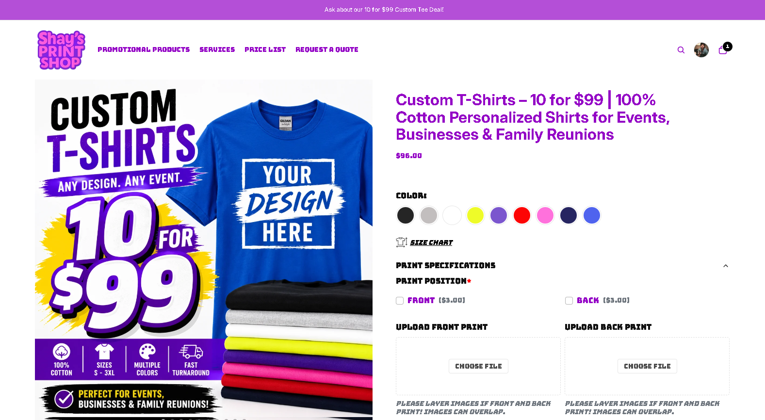
- Order 10 custom cotton t-shirts for $99 through our Custom T-Shirts page, ideal for testing color on your final fabric before a bigger event order.
- Check color-accurate drinkware with a Custom Tumbler sample before ordering a full team or business run.
- Get 12 custom 11oz coffee mugs for $75 through our Custom Photo Mug page, a practical way to proof a photo or logo on ceramic.
Upload your file, and we will help you get a proof that matches your screen as closely as a printed shirt, mug, or tumbler realistically can.
Sources
The ICC specification defines the rendering intents referenced throughout this guide. Printing Industries’ G7 overview sets the Delta E tolerances used as practical benchmarks. Mohawk’s RGB versus CMYK breakdown explains driver-level color adjustment risks, while Adobe’s color-managed workflow PDF covers soft proofing mechanics in Photoshop. EIZO’s Quick Color Match manual supports the monitor and lighting settings recommended above. For print-ready sizing on signage and related materials, see SnapPix’s QR code sizing guide.
- Printing Industries - Maintaining a G7 print condition
- A Color Managed Raw Workflow From Camera to Final Print (Adobe)
- EIZO Quick Color Match user manual
FAQ
How do I color match for printing?
Calibrate your monitor and viewing light, apply the correct ICC profile with a suitable rendering intent, soft proof your file, turn off automatic color adjustment in your printer driver, then print and measure a physical proof on your final material. This sequence, detailed in the G7 calibration standard, catches most mismatches before a full order ships.
What is the best color matching tool?
There is no single best tool since a hardware colorimeter for monitor calibration, an ICC profile for your specific printer and paper, and a spectrophotometer for measuring proofs each cover a different part of the workflow. The ICC specification is the standard both consumer and professional tools rely on.
What is the best free color matching software?
Most major design applications, including free and low-cost editors, support ICC profile assignment and soft proofing without extra cost, since Adobe’s color-managed workflow describes settings available across comparable software. The tool matters less than whether you actually use its soft-proofing and profile-embedding features.
Can I match colors from a photo?
You can get close by soft proofing the photo against your printer’s ICC profile and adjusting any colors flagged as out-of-gamut, but a photo taken on a phone or camera under mixed lighting will rarely match a printed piece exactly. Proofing on your final substrate, as covered above, is the only reliable way to confirm the match before a full print run.
0 comments