

Yes, you can get a Pantone match on apparel, but the method decides how close you’ll actually land. Bulk dyeing and lab-dip approval get you the tightest, most repeatable match. Spot-color screen printing comes close. DTF and DTG conversions get you a good approximation, not an exact hit. Fabric, base color, and finish all shift the outcome, which is why sample approval matters more than the code you start with — see how to match ties to dress shirts for any occasion for practical color coordination examples.
TL;DR:
- Providing a physical Pantone swatch and a written tolerance leads to more accurate apparel color matching than relying on digital sample previews alone.
- The best repeatable match results come from lab dips for dyed fabrics or printed strike-offs for screen-printed garments, with sign-off required before bulk production.
- Pantone textile systems account for fiber and fabric behavior, making color matches on apparel inherently less precise than paper-based Pantone standards.
- DTF printing offers a more consistent color match than DTG or direct conversion from Pantone codes, especially on saturated or complex colors.
- Sending clear details such as fabric type, finish, and acceptable variation helps ensure a smoother process and reduces the risk of costly revisions.
Table of Contents
- What Pantone matching apparel actually means for textiles
- How Pantone matching happens in production
- Why your Pantone match can still shift on the shirt
- How to request a Pantone match: a buyer’s checklist
- How Shay’s Print Shop handles Pantone-matched orders
- The honest take on Pantone accuracy in apparel
- Get Your Custom Apparel Order Started
- Sources
What Pantone matching apparel actually means for textiles
Pantone matching apparel isn’t the same as matching a logo on paper. Pantone runs two separate reference systems: paper-based swatches for print and graphics, and textile-specific systems built as TCX (cotton) and TPG (paper for textile design) formats. Those textile chips account for how fiber and dye behave, which a coated paper swatch never will.
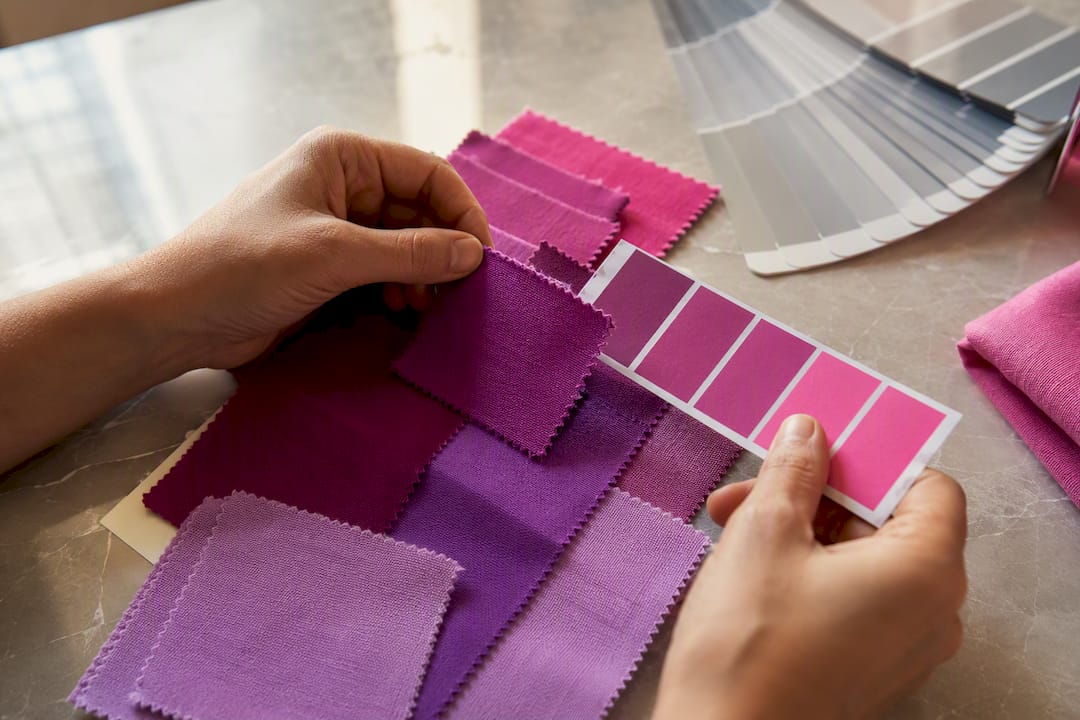
This is why a designer picking a color on a monitor and a printer mixing ink for cotton can land on two different results from the “same” Pantone code. Pantone Connect and Color Bridge exist to translate a spot color into RGB, CMYK, or hex for digital handoff, and they’re genuinely useful for briefing a printer or designer. But Pantone itself is upfront that on-screen simulations don’t substitute for a physical standard. Screens vary by calibration, ambient light, and even the device you’re viewing on, so treat any digital preview as a rough guide, not a final answer. The physical swatch book, and later the physical lab dip, is what actually rules.
How Pantone matching happens in production
Getting from a Pantone code to a finished garment runs through a fairly standard production sequence. Each step exists to catch a mismatch before it becomes 500 shirts in the wrong shade.
- Swatch reference. The buyer supplies the Pantone code, ideally pulled from a physical TCX or TPG chip rather than a screen pick, so everyone starts from the same physical standard.
- Lab dip approval. For dyed goods, the mill produces a small dyed swatch, the lab dip, matched against the target Pantone. This is the closest and most repeatable route to a true match because the color is built into the fiber itself, not applied on top of it.
- Strike-off for printed goods. For screen printing, the shop mixes spot ink to the Pantone formula and prints a test strike-off on the actual fabric and color of shirt going into production.
- Color approval sign-off. The buyer reviews the lab dip or strike-off under normal lighting and signs off before bulk production starts.
- Bulk production. Only after written approval does the order move to full runs, whether that’s dyeing yardage or printing hundreds of shirts.
Screen printing with spot inks gets genuinely close to a Pantone match because the ink formula is built directly from the Pantone color, though opacity and coverage on textured or dark fabric can shift how it reads. DTF and DTG, on the other hand, print through a CMYK or similar process, converting the Pantone color rather than mixing it directly. That conversion is where color drift creeps in, especially on saturated brand colors like deep reds or specific blues. If you want to understand which printing route fits your color needs, comparing DTG and DTF side by side helps before you commit to a method.
Why your Pantone match can still shift on the shirt
A Pantone code is a fixed number, but the fabric it lands on is not a fixed surface, and that’s where most color disappointments come from.
Fiber and weave change how color reads. Cotton absorbs dye differently than a poly blend, and a tighter weave reflects light differently than a looser one. The same ink or dye formula can look noticeably different on a ringspun tee versus a heavyweight fleece.
Base garment color limits your options. Printing a bright Pantone color onto a dark shirt almost always requires an underbase or works better with dyeing instead. If exact color fidelity matters more than budget, dyeing on a light or natural base beats trying to print your way around a dark garment.
Metamerism is real, and it’s sneaky. A color can match perfectly under one light source and look off under another, which is why proofs should get checked under the lighting your shirts will actually be seen in, whether that’s a trade show floor or outdoor daylight.
Washing and finish affect longevity, not just first impression. A color that matches on day one can shift after a few wash cycles if colorfastness wasn’t tested.
To reduce revisions and disappointment:
- Send a physical Pantone swatch, not just a code, whenever possible.
- Order an extra lab dip or strike-off if the color is critical to your brand identity.
- Set a written acceptable tolerance before approval, not after.
Pro Tip: Check your approved sample under the same lighting your product will actually be seen in, event tent, storefront, or office. A shirt that looks perfect under fluorescent office light can read differently outdoors.
How to request a Pantone match: a buyer’s checklist
Before you request a Pantone match on apparel, gather the specifics that let a printer actually deliver instead of guess.
- Pantone code from the correct system. Provide the TCX or TPG code, not a generic paper swatch number, since textile and graphic systems don’t always translate one-to-one.
- Vector artwork. Send print-ready vector files rather than flattened images; this matters even more when color accuracy is part of the deal. If you’re unsure what format to send, a guide to print-ready file formats clears up the common mistakes.
- A physical swatch if you have one. A real Pantone chip beats a screen color every time.
- Preferred substrate and finish. Tell the printer the fabric type, garment color, and whether it’s dyed or printed, since that changes what’s achievable.
- Your tolerance for variation. Decide upfront how close is close enough, and put it in writing.
Lab dips and strike-offs add cost, and printers typically fold that into minimum order quantities or a small per-unit surcharge for color-critical work. Expect a few extra days added to your timeline for that first proof round, then a faster turnaround once color is locked and bulk production starts. Ask your printer directly about tolerance standards, whether they test for washfastness, and how many rounds of revision are included before extra fees kick in. Getting those answers before you order saves you a repeat order later.
How Shay’s Print Shop handles Pantone-matched orders
Shay’s Print Shop builds around 100% cotton garments with DTF printing as the core production method, which makes it a solid fit for buyers who want durable, comfortable shirts without committing to a full dye run. The 10 shirts for $99 pricing is a transparent starting reference, and any color-matching request that needs an extra proof or lab dip gets quoted separately so you know the cost before committing.
When a buyer requests a Pantone match, the process runs like this:
- Share your Pantone code (TCX preferred) and, if you have one, a physical swatch.
- Shay’s reviews the code against DTF capability and flags any fabric or base-color limits upfront.
- A proof gets generated and sent for approval before your order enters bulk production.
- Once you sign off, the run proceeds on the timeline already quoted.
That sequence exists for the same reason lab dips exist industrywide: it’s cheaper to fix a color mismatch on a single proof than on a finished order of shirts.
The honest take on Pantone accuracy in apparel
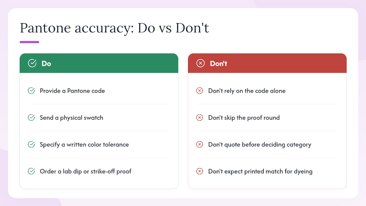
Most guides on this topic oversell precision. They talk about Pantone matching like it’s a settings dial you turn until the number lines up, when in practice it’s a negotiation between your target color and what a given fabric and process can physically deliver. The conventional advice tells you to “provide a Pantone code.” The better advice is to provide a code, a physical swatch, and a written tolerance, because the code alone tells a printer almost nothing about how forgiving you’ll be when the fabric shifts the result slightly.
Where most buyers go wrong is skipping the lab dip or strike-off step to save time, then getting surprised at bulk delivery. That single proof round is the cheapest insurance you can buy in this entire process. If your brand color is genuinely non-negotiable, dyeing on the right base fabric beats any printed conversion. If it’s close enough that a proof and sign-off satisfy you, spot-ink printing or a well-managed DTF run gets you there faster and at lower cost. Decide which category your project falls into before you request a quote, not after you see the first sample.
— Jon Will
Get Your Custom Apparel Order Started
Shaysprintshop skips the agency runaround that slows most custom color requests down: you send your Pantone reference and artwork, get a real proof, and move straight to production without waiting on multiple rounds of back-and-forth. That’s a real advantage over shops that treat color matching as an afterthought instead of a built-in step.
Whether you’re outfitting a family reunion, a small business launch, or a team event, the 10 cotton shirts for $99 package gives you a clear price before you even talk color specifics. Need matching drinkware to go with the order? A custom tumbler can carry the same color scheme across your merchandise. Upload your logo or artwork, share your Pantone code and any swatch you have on hand, and request a proof before your order locks in for production.
0 comments